The results of statistical data processing are drawn up in the form of statistical tables. The tabular form allows you to present the material in the most convenient, compact, visual and rational way. The use of tables as a means of systematizing data can be found in the works of D. Ground, W. Petty, G. King. Statistical tables, which can be considered as a completely scientific representation of statistical material, were first used in the works of the Russian academician L.Y. Kraft. A great contribution to the development of the theory of the tabular method was made by Russian statisticians A.A. Chuprov and A.A. Kaufman.
Statistical tables superficially represent a certain kind of intersection of vertical graphs and horizontal rows that form cells designed to record statistical data in them.
When applying only rows and graphs without their names and statistical data, a graphene grid is obtained, which is called the skeleton of the table. If the skeleton of the table is filled with the names of rows and graphs, then a table layout will be obtained.
A statistical table can be thought of as a form of logical sentence having a statistical subject and a statistical predicate. The idea of likening a statistical table to a grammatical sentence belongs to A. Kaufman. The subject of the table represents the statistical population referred to in the table, i.e. a list of individual or all units of the population or their groups. The predicate of the table is a numerical characteristic of the population under study.
Statistical tables can be simple and complex. The simple ones include list tables, in which the subject is a list of individual objects (factories, districts, republics, cities), and dynamic tables, where the subject is individual years, months or other periods of time. Tables, in the subject of which there is a grouping on one basis, are called group tables.
If there are two or more features in the subject grouping, the table is called a combination table (Table 10).
Table 10 Resource requirements by component
Dependence of workers’ output on the volume of production and electric labor-to-weight ratio
Groups of companies | Number of companies | Average number of employees, people. | Volume of manufactured products, mln.rub. | Average annual output of one worker, million rubles. | |
by volume of products, mln.rub. | on the electro-armament of labor, kWh per 1 person | ||||
up to 10 | 5-10 | 6 | 11200 | 40440 | 3,6 |
10-20 | 6 | 9100 | 37310 | 4,1 | |
Total: | 12 | 20300 | 77750 | 3,8 | |
10-20 | 5-10 | 10 | 27200 | 136000 | 5,0 |
10-20 | 8 | 21000 | 119700 | 5,7 | |
Total: | 18 | 48200 | 255700 | 5,3 | |
over 20 | 5-10 | 4 | 15200 | 103360 | 6,8 |
10-20 | 6 | 21100 | 156140 | 7,4 | |
Total: | 10 | 36300 | 259500 | 7,1 | |
Altogether: | 5-10 | 20 | 53600 | 279800 | 5,2 |
10-20 | 20 | 51200 | 313150 | 6,1 |
The construction of statistical tables begins with the development of the layout of the future table. The table layout includes the following elements: a common title, a skeleton, the full name of the subject and all its components, the name of all the columns of the predicate, the final rows and graphs.
There are certain rules that must be followed when designing tables:
(1) Each table should have a title that should reveal its contents in a concise manner. The name should indicate the boundaries of the statistical population, the period or point in time to which the data relate. If the unit of measurement for all data in the table is the same, it is advisable to put it in a common header;
2) The columns of the table, if there are many of them, it is desirable to give numbering;
3) A mandatory attribute of the statistical table are the resulting rows and graphs. In complex tables, a distinction should be made between “total” and “total”. “Total” is a characteristic relating to a certain part of the population, and “total” is the total as a whole for the totality being studied;
4) Rounding of numbers in all columns and lines should be carried out with the same accuracy (up to an integer, to a tenth, to a hundredth). Multi-digit numbers consisting of four or more digits must be written, separating every 3 digits from each other for ease of reading and comparison (117,819,350);
5) In the statistical table, each cell must be filled. However, in some cases, the numbers in the cells may be missing and the reasons for the absence should be shown in the table. If there is no information about this fact, then the fact itself takes place, put 3 dots (…). If the phenomenon itself is absent, a dash (-) is placed. If the cell cannot be filled, put (x). If there is an indicator, but its size is lower than the minimum figure that can be recorded according to the accepted unit of measurement, then (0) is put in the column;
6) Numbers in table cells may be accompanied by certain icons. If the number is obtained on the basis of imputations, it is recommended to take it in brackets. Doubtful numbers must be accompanied by (?) and provisional numbers must be accompanied by (*).
The graphic method is a method of conditional images of statistical data using geometric shapes, lines, points and various symbolic images.
Graphs in statistics are conditional images of numerical quantities and their relationships in the form of various geometric images – points, lines, flat shapes.
Each graph consists of a graphic image and auxiliary elements. A graphic image is a collection of points, lines, and flat shapes that depict statistical data.
Auxiliary elements of the graph are the graph field, scale, scale scale, explication of the graph.
Any statistical graph consists of a planar representation of the phenomenon under study in some space, called the graph field, with the help of signs (points, line segments, circles, sectors, geometric shapes, silhouettes).
To understand the graph, an explanation of the signs, scale and the name of the graph are given.
Scale is a conditional measure of translating a numerical quantity into a graphic quantity and vice versa.
A scale scale is a line divided into segments by dots.
Explication of the chart is an explanation that reveals the content of the chart: the title of the chart, units of measurement, symbols.
The variety of graphs used in statistics is due to differences in their content, methods of construction and the breadth of the range of phenomena and processes depicted by them.
According to the shape of the image, the phenomena of graphics are divided into diagrams, cartograms and statistical figures (pictograms). The most widely used diagrams are:
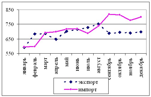
linear in a rectangular coordinate system, which are used to characterize the change of phenomena in time, in the study of relationships between phenomena, to illuminate the progress of the execution of plans.
in the polar coordinate system: columnar, which are used to visually compare the volumes of phenomena under study in time or space.
They are indispensable when on one graph you need to show the dynamics of several phenomena.
ribbon; sectoral (structural-relative and structural-absolute). They are used to depict the structure. The area of the whole circle is taken as 100 %:
 ,
,
where ![]()
![]() is the percentage phenomenon.
is the percentage phenomenon.
Cartograms are used when the problem of graphical display of the geographical distribution of the phenomenon under study is solved. A cartogram is a contour map or plan of a territory on which the values of indicators characterizing individual parts of the depicted territory are applied using dots, background signs or isolines.
There are point, background and isolinear cartograms.
In point cartograms, the values of statistical indicators are plotted using points, the number of which corresponds to the size of the phenomena depicted.
On background cartograms, statistical values are indicated by various types of hatching or coloring of territorial units. These cartograms are mainly designed to depict relative and average values (population density, yields, electricity generation per capita). Larger values of the displayed indicator should correspond to a thicker hatching or a more intense coloring. The number of groups should not exceed 6-8, as otherwise visibility is lost.
An isolinear cartogram is constructed by drawing lines on the map connecting places with the same value of the indicator.
As signs for the graph, you can use figures whose shape characterizes the phenomenon under study. This is a pictogram (for a graphic representation of the growth of the built housing, a drawing of the house can be used as a sign).
Varzar signs (1881-1940) are used in cases where it is necessary to compare the quantities that are the products of two multipliers and show the role of each of them in the formation of this value.